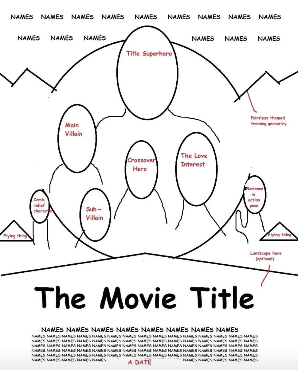
Amelia Bamsey asks on Creative Bloq: Why does every movie poster design look like this?
This spot-on superhero movie poster template was posted on Twitter by webflop.
Amelia writes:
“The post has gathered up lots of attention online and has already rounded up over 430,000 likes and 47,600 retweets on Twitter. While the original tweet was meant to poke fun at today’s movie poster designs, many users responded with their favourite posters that break away from this format.”
Here are some of the best posters of 2021 and of all time.
And here are some movie poster design templates.
My take: So funny because it’s so true! The problem I have with superhero movie posters is the same one I have with superhero movies: so many characters and so much busyness, but a dearth of ideas and anything I’m actually interested in. I have two suggestions for movie posters: one, make sure to come up with a snappy title and a killer central image while writing the script so that you can begin designing and capture that image during production, and two, put the title on the top half of the image — too often I’ve seen titles in the bottom third get covered up with extraneous material and supers.

